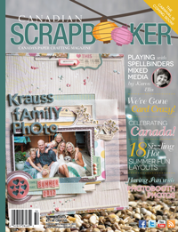
I started out the day thinking about accomplishing the "Its a Sketchy Challenge" over at the Canadian Scrapbooker website at http://www.canadianscrapbooker.ca/sketchy/ And although it jump started my evening, it doesn't really look like the sketch. I might still enter it but I have a stamp somewhere that I might try to put on it and I have no idea where it is now...
Anyways, I am IN LOVE with this Little Yellow Bicycle paper and of course these pics... I just picked up the paper today and I couldn't have picked it out any better to match Ryan and Jane's eyes. Its a simple layout, which is strange for me but I really didn't want anything too busy as I wanted the focus on the photos. Here's my layout!!
Materials Used: Little Yellow Bicycle Winter Twig/Snowy Aspen paper, Jillibean brown paper, BG LIfe of the party alphabet stickers, Lilybee ABC stickers, SU Island Indigo ink and baker's twine, SU pearls, SU buttons and SU rub on (chat room)
Since I was so happy with the matching of the above, I decided to tackle an even bigger project. I've had this on my list for too long so I put together a second round of samples for my friend Jennifer who is getting married in the Fall. Table "numbers" is where I decided to start! She is a speech therapist although ther emay be a more technical term so she is going to have 26 tables for each of the alphabet (maybe more if the guest list keeps growing.. lol) I started out with a couple samples that looked like this but I am not overally excited how they turned out.. I think its because I don't love the 'perfect bow'. I also don't like the mini doily - you see, we are looking for a elegant yet vintage feel. Her colors are off white with a very subtle pink. Note that these are all in the whisper white but should match the decor. The off white paper everywhere in this world seems to be too "yellow-y".
Materials Used: All Stampin Up product re: Labels Framelits collection, Largie Delicate Doily Sizzlit, Apothecary stamp set, Whisper White organza ribbon, Pink Pirouette taffetta ribbon, Victoria trim ribbon, Whisper White card stock, & Basic Gray ink
I did like parts of the above so I carried on and looked at our first sample (included on the left below) and compared it with a new look that is more clean and elegant. This basically used the organza ribbon in a more elegant way and I included some SU pearls as well (I forgot them above). And a final sample just adding a strip of the SU pink pirouette taffetta ribbon:
So, this led me to consider her placecards to match. She initially wanted to go with "place cards" that were butterflies on the wine glasses (3 colors for different meal choices) but it sounds like the hotel was not fond of this so we had to axe that idea. Here's what I mean if you are interested (these are not new):
Materials Used: All Stampin Up re: Bigz Beautiful Butterflies Die, Precious Butterflies stamp set with versa mark, and pearls. Clear Staples sticker labels used for names.
I still love those butterflies so I decided to whip something up (and I do mean WHIP because I reused the butterflies from before with the paper slits in them). So remember these are PROTOTYPES. I stuck the butterfly on the whisper white placecard embossed with the SU exclusive Elegant lines embossing folder. I did this just to show her! I used the Crumb Cake brown color previously but switched to the gray to remain elegant but also match the color scheme of her invites. This would look nice using the crumb cake paper as well - so this is just to compare.
Materials used: See above and below descriptions
And finally, I put together three different placecards representing each of the different meals. These have a few unique pieces but should work out well. The grey patterned paper is discontinued but the current SU Twitterpated paper works perfect!!
Materials used: All Stampin Up re: Whisper White paper, Elegant Lines embossing folder, Pink Pirouette Designer Series paper, Basic Grey retired paper pack, pearls, Four Frames stamp set, organza whisper white ribbon and basic grey ink
Alright - so we have lots to go, the biggest piece being the program although we've already picked out a style. Once we narrow down the color schemes there some signage that she'd like to have, a few favor cards and the programs. Stay tuned!
Cheers!
Cathy


Wow! Gorgeous work, you are out of control ;)
ReplyDelete